Can my niece design a better poster than your creative agency?
Designing a decent poster can be child’s play if you follow two basic principles.

My four-year-old niece recently drew a picture of me. At best, I would describe it as average. It bore no direct resemblance to me (I was green and taller than a house), but you could at least tell that she had some sort of grasp of the basic principles of composition. A solid four out of 10.
Of course, I didn’t tell her that. I lavished her with (undue) praise, proudly stuck the grotesque impression of me on the fridge and gave her an ice cream as a reward.
To my mind, a similar scenario is currently playing out across the out-of-home (OOH) industry – campaigns being endlessly applauded for doing little more than getting the basics right.
LinkedIn and trade press have been awash with praise for an (apparent) new style of OOH advertising, commonly referred to as minimalist OOH. You know the sort of thing: big, bold use of distinctive brand assets; minimal direct brand signals.

Read a post featuring one of these ads and it will inevitably be accompanied by comments like “so brave”, “so bold”, “what clarity”, “what focus”.
But is such praise really justified? Or do these ads simply stand out because they manage to get the basics of poster design right in a world where most people get it terribly wrong?
I would argue the latter.
The basics of poster design
A question for the ages: if a tree falls in a forest and no one is around to hear it, does it make a sound?
A simpler, slightly less philosophical question could be asked of poster design:
if an ad appears on a street and the viewer fails to recognise which brand it’s for, is it an ad for that brand?
The answer is no. For any poster to stand any chance of success, it must anchor back to the brand. Fail to get this right, and it doesn’t matter how emotive your imagery is or how clever your copy – your ad is dead in the water.
Ensuring you get the basics right isn’t rocket science. You just need to ask yourself two fundamental questions:
- Do enough light and non-brand buyers have an existing memory of these brand signals for me to use them?
- Are the brand signals on my poster large enough to be seen?
We must specifically ask about light and non-brand buyers, as these are:
- Our key audience for brand growth
- Going to find it more difficult to anchor our messages back to the brand, as they’ll have smaller, less fresh brand memory networks
Putting it into practice
With these two questions in mind, let’s put a couple of recent posters through their paces. First up, this one for American Express:

There’s no shortage of brand signals here – the iconic Gold Card, that signature Amex blue, and the line ‘Don’t live life without it’ – but just scattering them across a poster doesn’t mean they meet our core principles.
Question 1: Do enough light and non-brand buyers have an existing memory of these brand signals for me to use them?
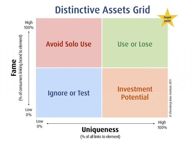
Thanks to the wonderful work of Jenni Romaniuk of the Ehrenberg-Bass Institute, there’s a simple way to answer this using her distinctive asset grid.
First, we remove any direct brand signals from the ad (eg the logo that clearly references American Express) and ask 1,000 category buyers to identify the brand based on this stimulus.
The resulting data provides two important metrics:
- Fame: The percentage of category buyers who correctly guess the brand, ie whose brains contain a salient link between the brand and the collective assets
- Uniqueness: The brand’s level of ownership over the combined assets, calculated by the number of ‘wrong’ guesses (confusion with competitors)
Based on these results, ads can be placed on a distinctive asset grid to understand their potential for use:
If your ad fails at this early stage, you’ll need to either rethink the distinctive brand assets you’re using, or ensure you include a very healthy dose of direct brand signals to make up for their shortfall (and no, that doesn’t mean a tiny logo in the corner).
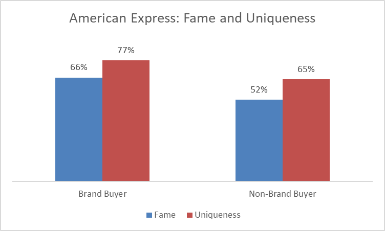
For American Express, we’re already on somewhat of a sticky wicket. The ad just about gets us into the top right-hand corner of the asset grid for both groups, but only by a small margin:
And we’re not out of the woods yet. To quote Romaniuk: “Copy that looks good on a computer screen or on a printed sheet of paper can fail in real life.”
Which leads us to the second question.
Question 2: Are the brand signals on my poster large enough to be seen?
There are no hard and fast rules for this one, but a little common sense will get you where you need to be.
Imagine you’re driving past this ad (as most of your audience likely are) at 20 or 30 mph. Average viewing times are about 1.3 seconds, according to Lumen Research. That time is split across multiple views at different distances – anything from 1 metre up to maximum of around 60 metres (as defined by industry standard Route).
So, with these kind of OOH exposures in mind, should American Express still be happy with its use of distinctive brand assets?
Absolutely not. Although plentiful, they are all subtly concealed in small, distant corners – nowhere near large or prominent enough to ensure visibility for drivers or pedestrians.
Real-world testing: MemOOHries are made of this
Because of this failure to meet the fundamentals of poster design, we included the Amex ad in Bauer Media Outdoor’s latest research study, ‘MemOOHries are made of this’.
Working with Lumen Research, we tested various ads using eye-tracking simulations. In this case, two groups of category buyers (ie credit card users) viewed a walkthrough video of a simulated urban environment:
- Group A saw the debranded version (eg no logo)
- Group B saw the full version.
The results were telling:
- Recall levels were worryingly low at between 7% and 11%
- Even worse, inclusion of the brand logo made no significant difference to recall – it was simply too small to compensate for the easily missed distinctive brand assets

What does good look like?
Given how straightforward the fundamental rules are, it’s no surprise that the best-performing ads are often the simplest. They recognise how limited audience attention is – and do everything possible to ensure the message clearly and quickly anchors back to the brand.
A standout example is KFC:

Question 1: Do enough light and non-brand buyers have an existing memory of these brand signals for me to use them?
Absolutely. Fame and uniqueness scores for the debranded ad were over 90% for both brand users and non-users.
Question 2: Are the brand signals on my poster large enough to be seen?
Need you ask? The entire ad is dedicated to just a few powerful, highly visible assets.
Having nailed the fundamentals, it’s no surprise that the ad performed well in testing:

While encouraging, these results also highlight the need for caution. Non-brand users exposed to the debranded ad showed just 5% recall – a gap that closed when the large KFC logo was reinstated, lifting recall to 27%. And it’s not just non-brand buyers who benefit from direct brand signals: brand buyers also respond positively, with recall increasing by 28% in branded versus de-branded executions.
When in doubt, call the brand out.
Interestingly, our findings also echo insights from recent work by Karen Nelson-Field and VCCP Media, which discovered that just 1.5 seconds of active attention can be enough to trigger ad recall – if the ad prominently features distinctive brand assets. That’s why making your brand easily recognisable is so crucial when audience attention is fleeting.
Credit where credit is due
So, while I wholeheartedly support the new wave of minimalist OOH, I certainly won’t be pinning any to my fridge.
Congratulations, you got the basics right when so many others fail to do so.
What do you want, a Cannes Lion?
No, but you do deserve an ice cream.
Lindsay Rapacchi is research and insight director at Bauer Media Outdoor UK.


